
#113 - 3 ways to confidently work with colour without using the colour wheel
Feb 25, 2025
Colour is one of the most powerful tools in food photography. It shapes mood, enhances storytelling, and makes images irresistibly mouthwatering. But many photographers feel trapped by the ‘rules’ of colour, endlessly trying to match the colour wheel or following the norms set by other photographers.
If you've ever doubted your colour choices, struggled to decide on a palette, or hesitated before introducing a bold new colour, it’s time to break away from rigid rules and start using colour fearlessly, with intention—but without overthinking.
Here’s an unconventional approach to working with colour - 3 simple ways to create a striking photo and an easy practice to simplify your workflow.
#1. Limit the colours in your frame
Less is more when it comes to colour coordination. The fewer colours you use, the less you need to coordinate, balance, and think about - the easier it becomes to create a visually compelling image. Working with limited colours in a composition can be a game-changer.
It doesn’t matter what the colour wheel says, choose colours based on your hero food.
For example:
- A red beverage on a blue backdrop
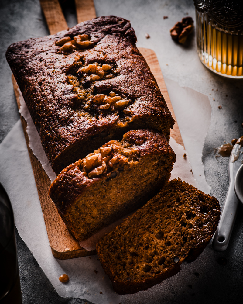
- Brown and green cookies with a matching earthy-toned setting
- Pink and red styling for a romantic dessert
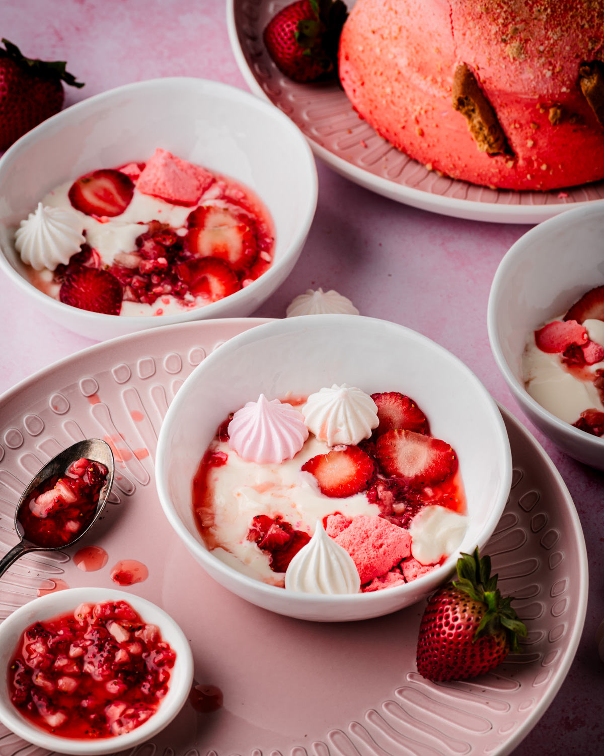
Typically, whites and blacks don’t count toward your two-colour palette—unless they are the main theme. So, if you’re shooting a chocolate cake with red raspberries on a white plate, that’s still a brown and red palette. However, if you’re working with a “black and white” theme, then, of course, those colours become the two primary colors.
Feel free to introduce a third or fourth colour into the scene but do it strategically to strengthen your main palette.
So, pick two colours that work for your scene, and don’t stress about where they fall on the colour wheel. Your main goal is to make the hero food stand out—be mindful of how dominant secondary colours are so they don’t take away the focus from the hero.
#2. Tap into the power of blacks and whites
We often think of black and white as neutrals rather than colour. But when used intentionally, they can be the secret ingredient to balance a composition.
The goal isn’t always to add more colour — sometimes, removing colour or introducing a neutral can make a composition more sophisticated and intentional.
Start thinking of black and white as part of your colour toolkit. You don’t always have to add more of the colours or an extra colour, sometimes you might need to add a neutral, white or black or maybe even replace some of the colourful elements with darks and lights to make your vision come to life.
#3. Check your colours before finalizing the shot
Here’s a practice to include in your workflow to instantly check if your colours work. This one’s easy but incredibly effective.
- Before you complete your final shot, pause and check your colour balance. Simply look at your screen, squint your eyes, and say each colour out loud as you spot it in the frame.
Let’s say you’re shooting a chocolate raspberry cake. You’d go:
**Red, red, red**
**Brown, brown, brown**
**Orange, orange**
If you suddenly notice a single colour appearing in the frame, like a napkin or cutlery — Ask yourself:
- Is this colour supporting my overall palette, or is it taking away the focus from the hero?
- Would this colour look better if it were cropped, tucked under a plate, or replaced with a neutral one?
- Does this element complement my hero food, or compete with it?
Simply repositioning an item or tweaking the placement can make all the difference. And if a colour doesn’t feel right, remove it and see how the visual impact changes.
This easy exercise will help you create stronger, more cohesive colour palettes without doubting your creativity.
Conclusion
Colour in food photography isn’t about rules—it’s about emotion, mood, and storytelling.
The colour wheel is a guide, not a rule. Don’t limit yourself to conventional colour pairings just because of the colour wheel or because most photographers use them. Some of the most striking photography happens when you break the rules and trust your creative instincts.
So, next time you’re planning a shot, try these 3 simple ways to work with colour:
✔️ Limit your palette to two or three colours
✔️ Use blacks and whites strategically to balance and enhance your composition
✔️ Do a colour-check before finalizing to eliminate distracting tones and refine your vision
These simple shifts will help you approach colour with confidence and ease — no overthinking, no second-guessing, just your best photography.
For questions or thoughts, drop me an email at [email protected] or send me a DM on Instagram at @dyutima_myfoodlens


